


How to style with Spicy Orange: The hottest interior colour trend right now
A monthly interior colour montage to inspire your home.

From bold feature walls to warm-toned accessories, Spicy Orange is popping up everywhere right now.
So, why is Spicy Orange the hottest interior colour trend of the moment?
This bold, vibrant shade is making waves in the design world thanks to its surprising versatility. Instantly adding warmth and cosiness to a space, while also nodding to the nostalgic charm of the 1970s retro revival.
In this month’s colour montage, discover how to style your home with Spicy Orange and get inspired with bold, uplifting ideas to bring energy and personality into your home interiors.
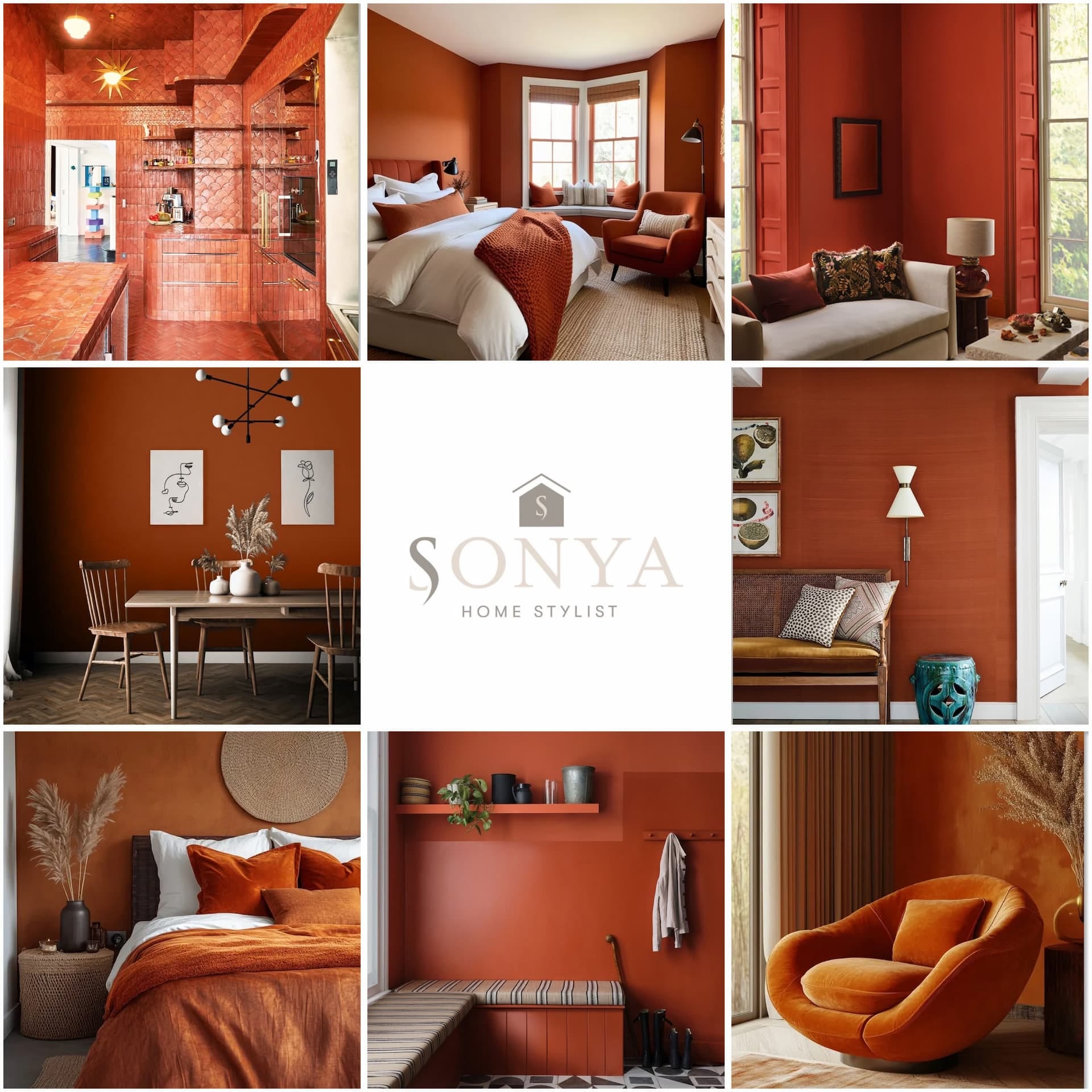
01.


We’re going straight in with this incredible kitchen from the home of Ramdane Touhami; a French-Moroccan artist, creative director and entrepreneur known for his bold, eclectic style.
Designed by Art Recherche Industrie, the art direction agency led by Touhami himself, this Parisian kitchen really does have the wow factor. The entire space is clad in terracotta, wrapped floor-to-ceiling in handcrafted clay tiles made in Umbria, Italy.
02.

This bedroom is a gorgeous example of how Spicy Orange can transform a space. The rich, earthy tone is perfectly balanced with a neutral palette of off-whites and oatmeal, creating a warm and inviting atmosphere.
I especially love how the painted walls frame the bay window, which has been cleverly turned into a cosy window seat. The crisp white window frames and bed linen provide a clean contrast, while tonal accessories in orange tie everything together seamlessly.
03.

Go big or go home with floor-to-ceiling, richly saturated Spicy Orange walls and shutters; a bold move that adds instant drama and warmth to any space.
The colour used here is Atlas by Paint & Paper Library, part of their Jewels capsule collection inspired by rare and semi-precious minerals.
Named after the Atlas Mountains, this earthy hue inspired by vanadinite crystals, known for their rich tones of burnt orange, red and clay.
Paired with soft neutrals, stone textures, and deep-toned accessories creates an effortlessly stylish look.
04.

Loving Orange by YesColours is a deep burnt orange with rich terracotta tones and a subtle red undertone.
Taking inspiration from the vibrant spices of India and the earthy warmth of autumn conkers, this shade brings a perfect touch of warmth to any living space.
05.

This fabulous pure silk, handwoven wall covering from James Hare makes an incredible statement; a luxurious alternative to paint or wallpaper that brings texture, depth, and elegance to any space.
06.

Recreate the boho look with a rich orange feature wall, layered with varying shades of orange in accessories and bedding.
Add natural texture woven fabrics, wood, and ceramics to evoke a warm, sensory space that feels both relaxed and curated.
07.

Another standout orange tone from the Paint and Paper Library collection is Caravan; an exciting Moroccan red inspired by the vibrant textiles of Berber tribespeople.
It’s a bold yet sophisticated shade that works beautifully when paired with warm neutrals, adding depth and cultural richness to any space.
08.

And relax…by sinking into this super-comfy chair.
This space is a perfect example of how well orange-on-orange can work; and I’ll admit I was pleasantly surprised.
Orange is such a bold, vibrant colour that I’ve always assumed needed to be toned down with neutrals. But here, it feels rich, warm and cocooning rather than overwhelming.
Share your appreciation for as little as £3.50 a month or subscribe to an annual membership for just £35 for the year.
And that concludes this month’s colour montage.
So what do you think?
Have I changed your perception on the colour orange, is it a shade you’d now consider incorporating into your home?
Do let me know in the comments; I’d love to hear your thoughts.
Thanks

Please tap on the heart 🤎 if you have enjoyed reading this post. I love hearing your thoughts, so feel free to comment. If you really want to help, please share by clicking the restack button. This helps with visibility and gets my work shared with more new readers, thank you!
If you’ve missed my previous colour montages you can catch up here:


Great selection of photos - hard to pick one that I like the most.
Surprisingly, I rather like it! Fantastic images & examples Sonya, but I’m still clinging on to the neutrals! If I was an adventurous sort, I’d definitely go here! 👌