Be inspired by Farrow & Ball's fresh new colour collection
A monthly colour montage to inspire your home.
At the end of last month, Farrow & Ball unveiled an update to their colour range, introducing nine new shades and reintroduced three favourites from their archives. This warm and charming palette is the perfect opportunity to refresh our homes and add a touch of cosiness.
Back in January, I shared Interior Design Trends you can kiss goodbye to in 2025. Among these, the once popular all-white and cream trend has finally given way to the delights of rich, baked earthy tones, which are set to dominate this year.
Farrow & Ball’s new colour range offers an array of rich, earthy tones to choose from, perfect for bringing warmth and character into your home.
For this months colour montage, I’ve taken a slightly different approach by featuring a selection of Farrow & Ball’s latest collection, rater than focussing on a single shade
Join me as I explore creative and inspiring ways to incorporate these stunning new colours into your home.
Joa Studholme, Farrow & Ball’s Colour Curator, is the brains behind the names of this new collection, and one of the things I absolutely love about this collection is how it’s been inspired by everyday “ordinary” objects from our home, such as a duster or a dibbler1.
“I started looking at things in the household that are really inspiring but are very ordinary.”
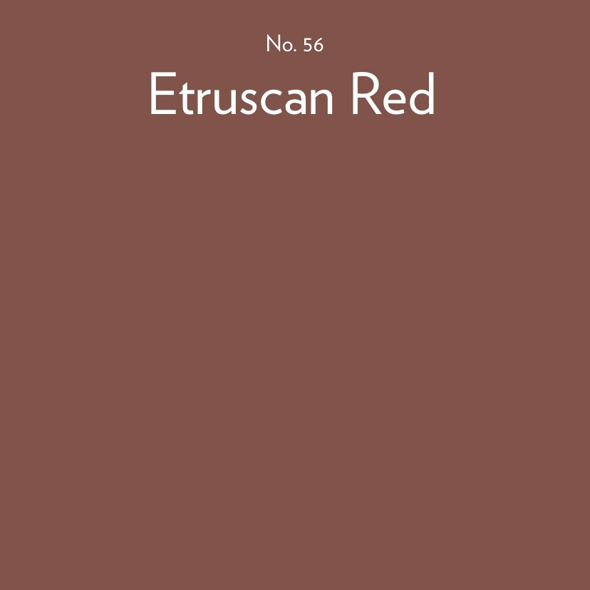
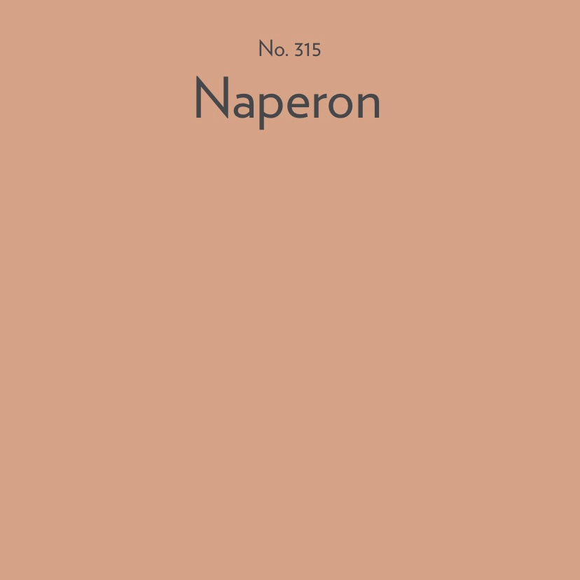
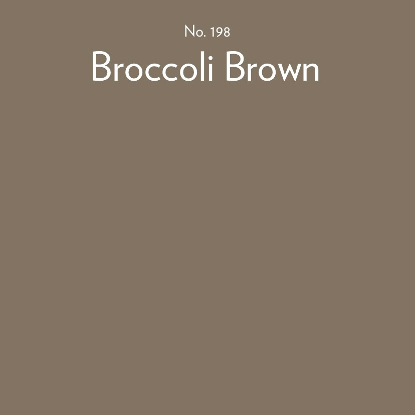
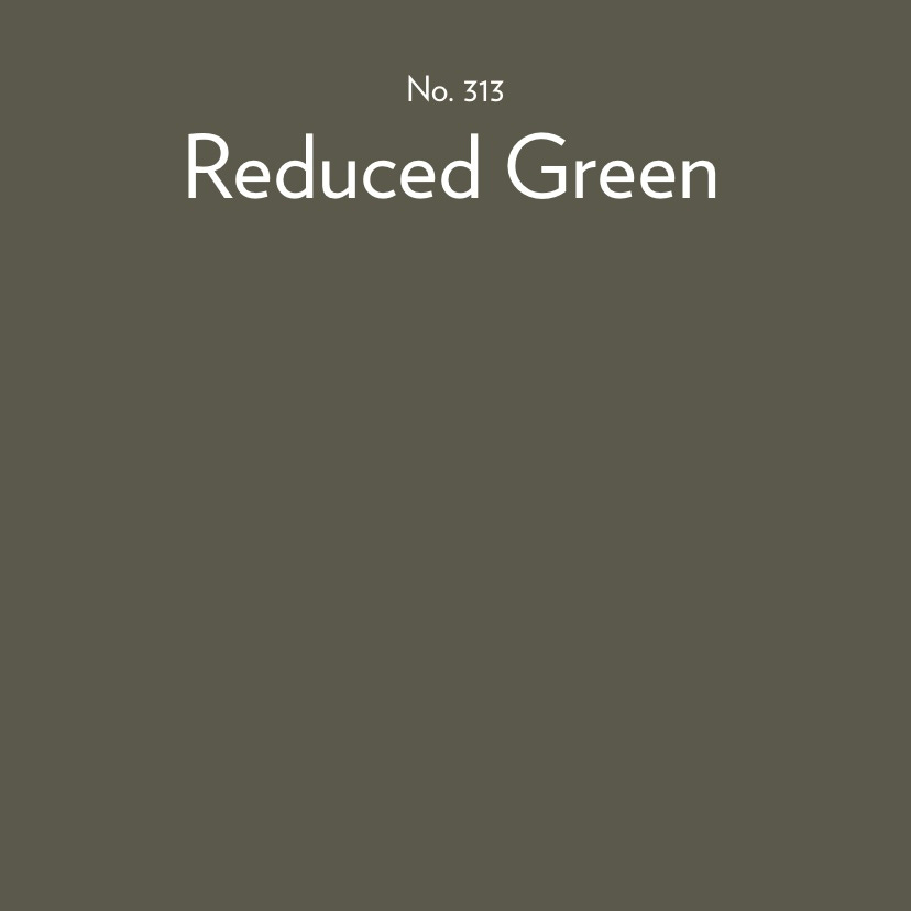
Before I share my inspirational selection for this months colour montage, I have chosen eight of the twelve colours for this new range.
After exploring the internet I’ve curated a selection of inspirational images that beautifully align with the new colour choices from the Farrow & Ball colour palette.
01.

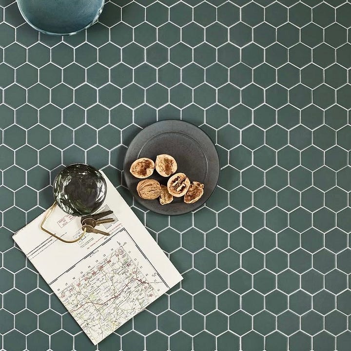
The tones used on these porcelain hexagon-shaped mosaics from Claybrook Studios is the perfect complement to Farrow & Ball’s Douter.
This timeless shade of green captures the essence of tranquility in nature, bringing a sense of calm to any space. It’s an ideal colour choice for homeowners looking to create a serene, inviting atmosphere.
02.
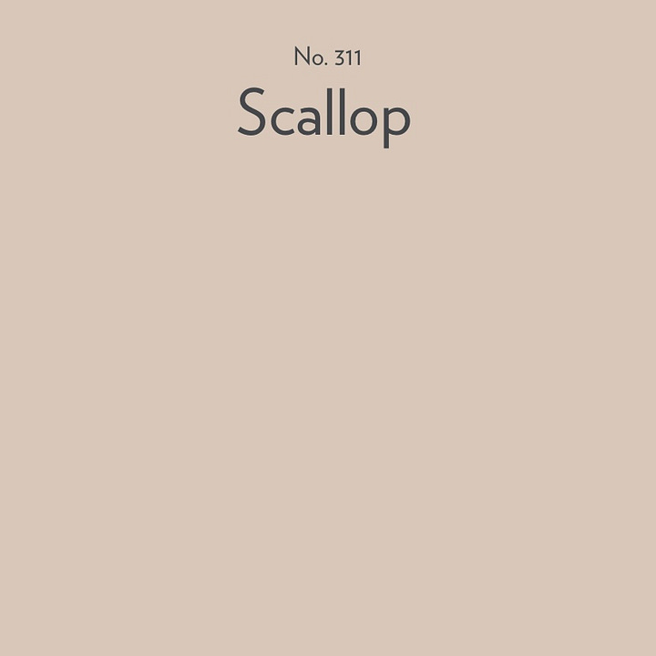
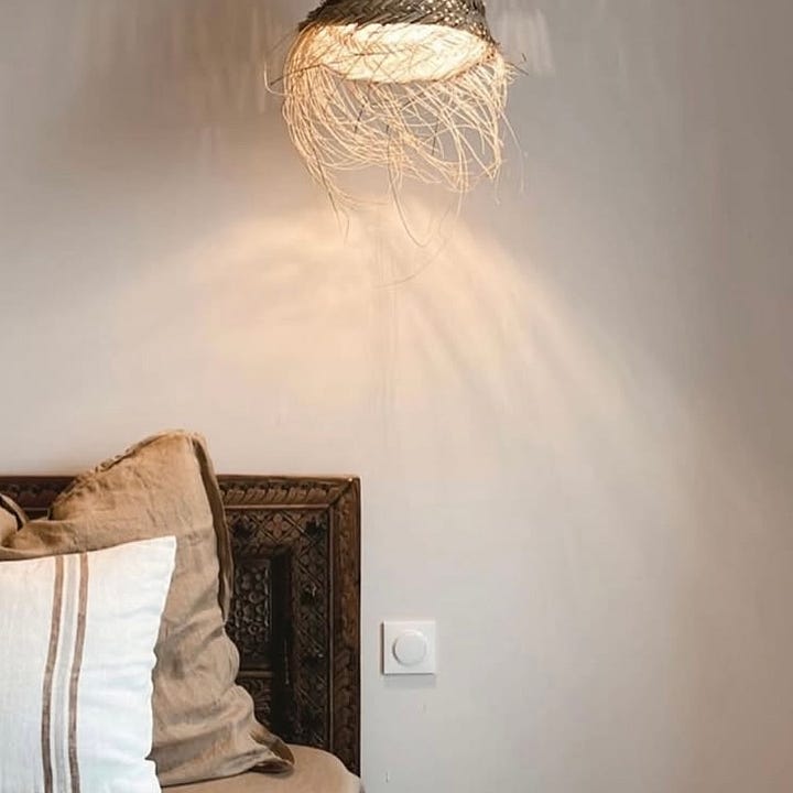
If you’re looking for a timeless neutral for your home, whether it’s a North or South-facing room, a bright yet earthy pale taupe is the ideal choice.
Mindful, a warm, tranquil shade from Coat Paints, beautifully mirrors the soft delicate tones of Scallop from Farrow & Ball.
This versatile colour adds warmth and serenity to any room, making it an ideal choice for a calm and balanced interior.
03.
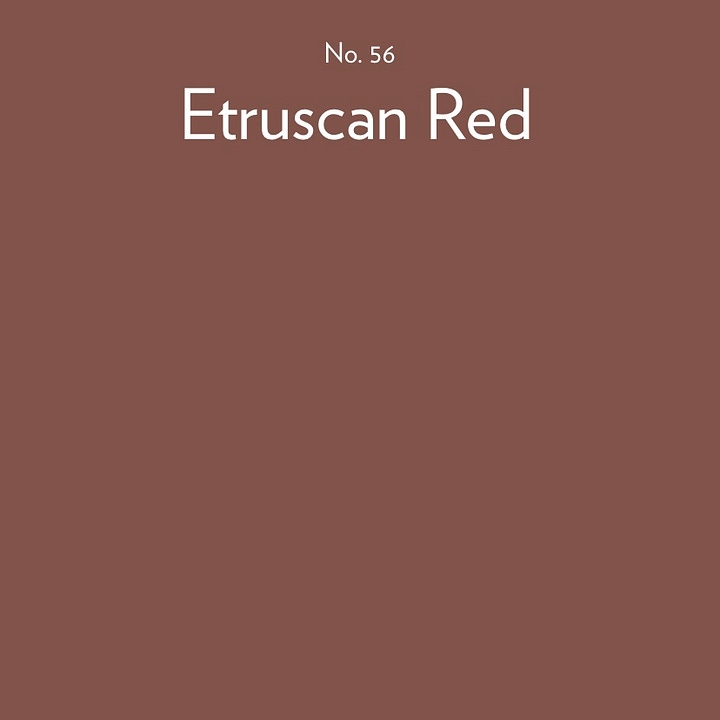
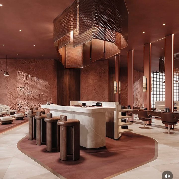
The Red Zen Beauty Salon in Dubai beautifully showcases the harmonious blend of a rich, warm colour palette. By combining rustic red tones with the subtle sophistication of neutral shades, it creates a space that feels both inviting and luxurious.
For a similar effect, consider pairing Farrow & Ball’s Etruscan Red with the soft, delicate hue of Scallop, a perfect combination for achieving both warmth and sophistication.
04.
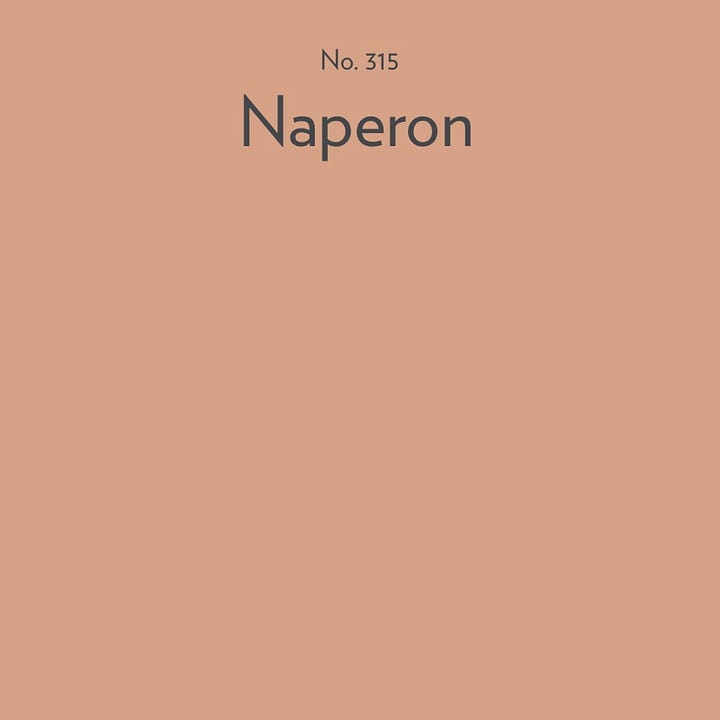
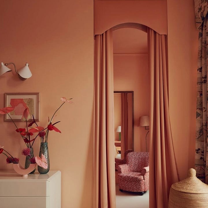
Golden Design, an architectural interior design studio based in London, created this stunning space for a project in Ladbroke Grove; showcasing the beauty of combining peach and apricot tones. These shades, often considered challenging to work with, come together effortlessly, creating a harmonious and inviting atmosphere.
Naperon is a perfect representation of this blend, merging the two tones into a single, cohesive colour. Its familiar terracotta hue adds a touch of warmth and character, making it an excellent choice for enriching your home’s interior.
05.
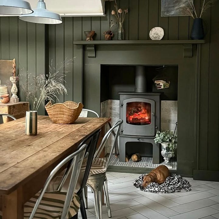
Marie Nichols’ kitchen is a stunning example of how effective deep, dark green tones can work. When paired with cool grey-white flooring and the natural warmth of wood, the result is a space that feels both balanced and homely.
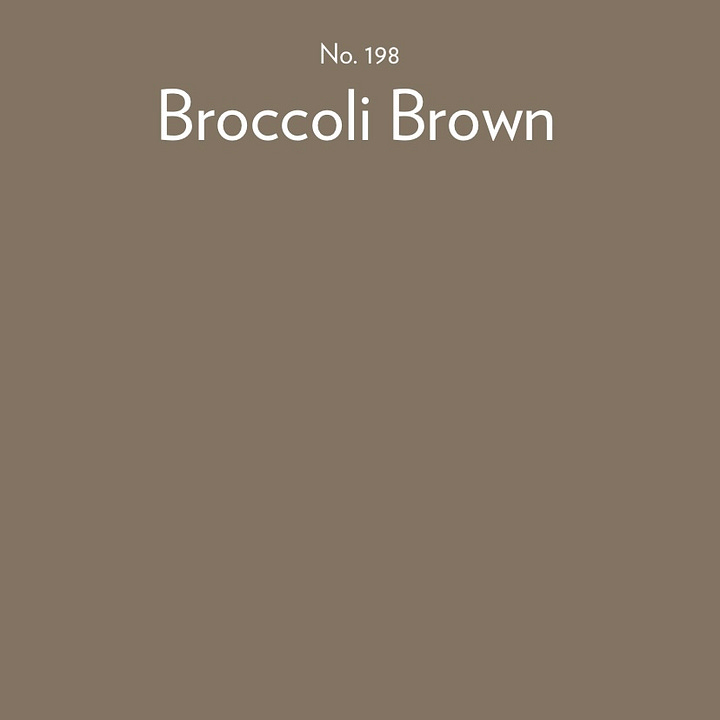
If you’re thinking of introducing darker colours into your home, Broccoli Brown or Reduced Green could be the ideal choice. Let this beautiful example inspire you in making that decision.
06.

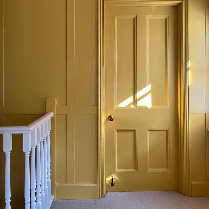
Laura from no.13luckyforsome demonstrates the art of colour drenching by using Yellow Pink from Little Greene to transform her landing.
This warm and inviting shade is strikingly similar to the newly introduced Farrow & Ball Duster. Both tones bring a soft, cheerful warmth to interiors, making them ideal for creating a welcoming and cohesive space.
07.

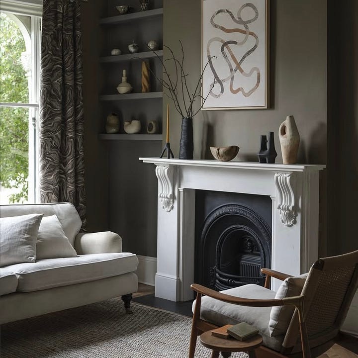
This versatile shade radiates elegance, effortlessly enhancing any interior with its sophisticated charm.
Take, for instance, this living room painted in Mortar from Benjamin Moore. The rich hue adds depth and tranquility to the space, creating a serene yet impactful environment.
If you're considering deeper tones for your home, Reduced Green is an excellent choice to achieve a harmonious and calming atmosphere.
08.

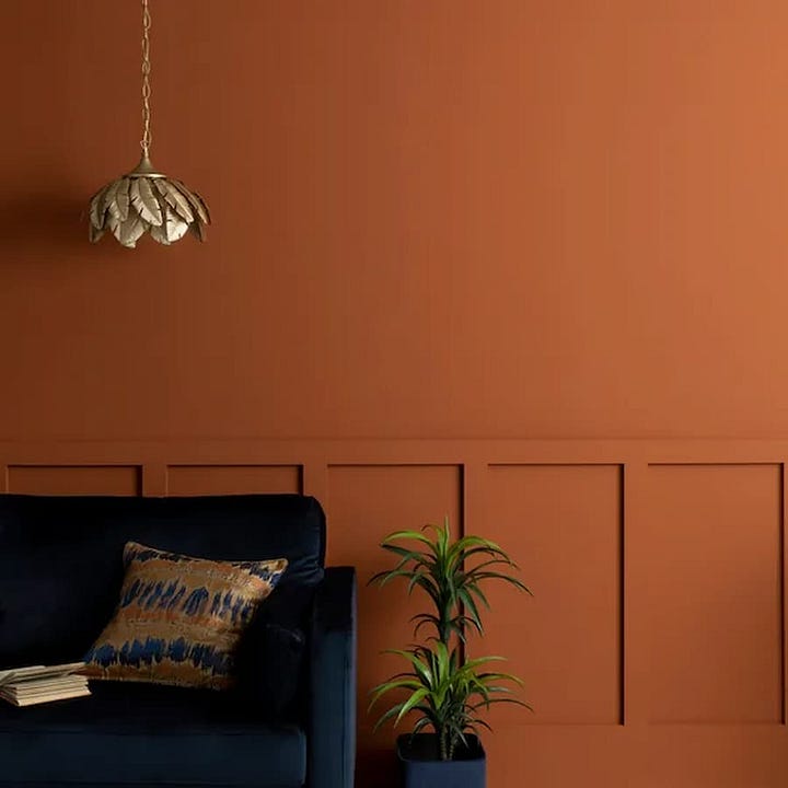
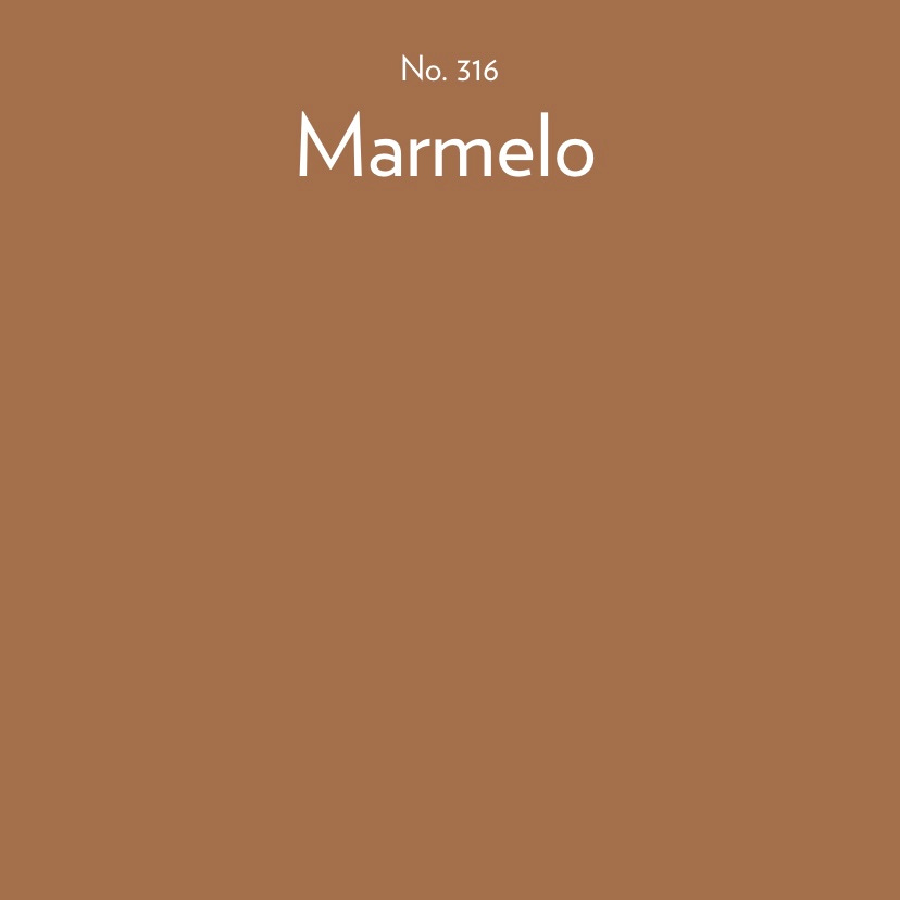
Marmelo is a rich, warm, almost toffee-like tone that pairs beautifully with warm neutrals.
For a bolder, more vibrant combination, consider the rich Butterscotch shade with Navy as showcased in this Dunelm image.
The colour combination creates a striking, yet cohesive look, while the gold highlights in the light pendant and cushion add a touch of luxury and sophistication.
If you’d like to share the love from todays post, why not Buy Me Coffee. ☕️
That concludes this month’s colour montage. I would love to hear your thoughts on this approach; did you enjoy the variety of colours rather than focusing on just one theme? Please let me know in the comments.
Next week, we’ll officially welcome the first day of Spring here in the UK (hurray)! I’ll be sharing some helpful tips on preparing your home for the Spring season.
Until then, have a wonderful weekend.
Please tap on the heart 🤎 if you have enjoyed reading this post. I love hearing your thoughts, so feel free to comment. If you really want to help, please share by clicking the restack button. This helps with visibility and gets my work shared with more new readers, thank you!
If you’ve missed my previous colour montages you can catch up here:
A pointed stick used to make holes in the ground for planting seeds, bulbs, and seedlings.








Very fond of Reduced Green.
I love this montage Sonya, the variety of colour images really works. Some great examples of how the new colour collection can be used. Spot on 👌