


Beautiful rich, warm colours to add comfort to your home
A monthly colour montage to inspire your home, plus a little reference to Valentines Day.

This months colour montage links quite nicely to the day of love, Valentines Day. Whether you're a fan or not, it's a perfect time to explore some beautiful rich, warm colours to add comfort to your home.
I’m not a huge fan of the overly commercialised Valentines Day, with its overpriced roses and unimaginative 3 or 5-course menus at restaurants.
I enjoy my own space at the best of times, so going out for a romantic evening with your loved one, only to find your chosen restaurant has squeezed in half a dozen more tables into an already crowded space, just doesn’t do it for me. I mean, who says romance is dead?
I’m not against sharing the love, but why should we be forced to show our affection on one particular day of the year?
Surely, sharing our appreciation for our loved one should happen throughout the year, even if in small gestures.
Valentines Day supposedly originated in the Middle Ages when people believed that February 14th marked the beginning of birds' mating season.
Geoffrey Chaucer, the English poet, wrote a poem called The Parliament of Fowls, which is credited with linking Valentines Day to romance in the 14th Century, as this was the day birds choose their mates.
Who knew?
Despite my sentiments, we do celebrate Valentines Day with a card; for me, a card is all that’s needed.

In previous years, the other half has turned up with a dozen red roses, which don’t get me wrong is lovely; who doesn’t love flowers?
However, as I always say, if he wants to show his undying love and devotion to me, consider it the other 50 weeks of the year (since florists tend to inflate their prices around Valentines Day), and ideally, not around the build-up to Mothers Day.
I’ll also be cooking a meal this evening in the comfort of our home, where we can create the perfect ambience; dimming the lights, listening to our own choice of music and the best part; being able to stumble onto the sofa with a belly full of food (and wine) in less than 2 minutes of leaving the dining table!
No waiting around in the cold for a taxi, or a drunken stagger home for us.

Anyhow, I’ve ended up going down a complete rabbit hole which wasn’t intended, so let’s get back to (hopefully) the reason you’re reading todays post which is the delights of this months colour montage.
A rich, warm colour palette of soft reds, earthy ochre tones and terracotta pinks is not my personal choice of home decor, however with strong rich colours playing homage for the desire to create a cosy, comforting home environment you can’t go wrong with this months selection if you’re looking for inspiration.
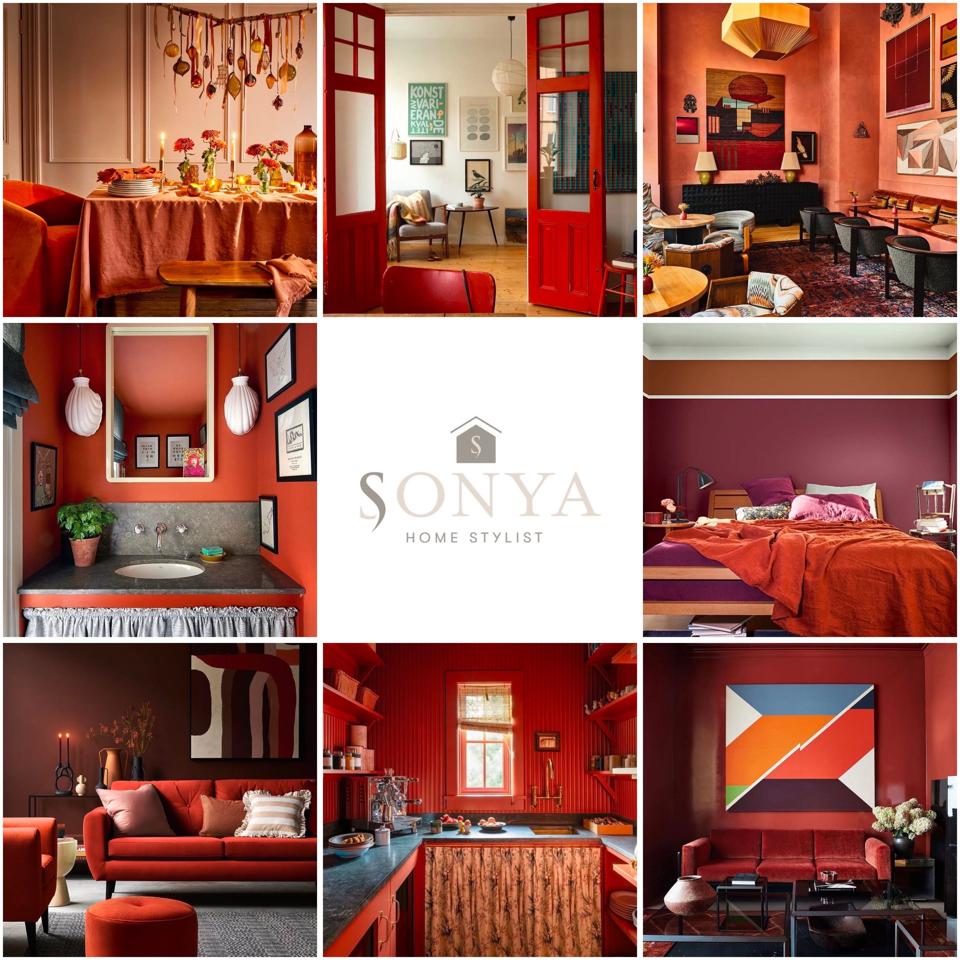
01.

Although this table setting was taken during the festive season from House Beautiful UK, the colour palette works perfectly for this months colour montage.
A stunning collection of terracotta pinks, rustic orange tones and earthy ochre tones. I’m also loving the hand-made branch decor positioned as a centrepiece above the dining table.
02.

The grandeur of these doors is a fabulous focal point that frames this space beautifully. This photo shows how effective a bold red “highlight” can really transform a space, especially with cleverly positioned pieces of furniture, also in red.
Combined with the natural wood tones of the floor and table, it’s the perfect combination if you prefer the less-is-more approach.
03.

Drawing inspiration from Mexican, Spanish and Moroccan design elements, the Dahlia Cocktail Lounge infuses a rich palette of colours ranging from ruby reds to terracotta pink and earthy ochre tones. This eclectic mix creates a warm, inviting atmosphere that is both visually stunning and incredibly cosy and comfortable.
04.

Interior designer Beata Heuman has chosen a slightly muted coral tone for her powder room, which works beautifully with the neutral tones of the shell light pendants and the delicate grey storage skirt. The combination creates a soothing atmosphere without being too intense on the senses.
Share your appreciation for as little as £3.50 a month or subscribe to an annual membership for just £35 for the year.
05.

Super striking bedroom makeover from Dulux, combining bold burgundies and rich ruby reds. These perfect winter colours add both warmth and a boost of energy that we all need at this time of year.
I particularly like the ochre stripe, which has been added just short of the ceiling. Simple yet effective!
06.

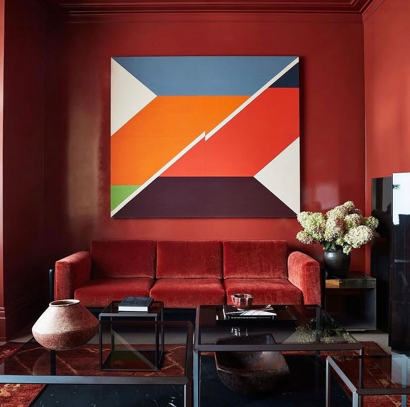
This image was actually found on sofa.com, and it wasn’t for the sofa design. I just love the interior from this lifestyle shot. The deep, rich painted wall and the stunning colours used in the artwork create the perfect palette for this months colour montage.
07.

How fabulous is this kitchen design by Heidi Caillier? Not only does it fit perfectly with this months colour montage, but the colour palette choice is also very bold (especially for a kitchen), yet it works so effectively.
08.
This penthouse apartment, designed by Neal Beckstedt, draws inspiration from combining modern abstract art with bold colours. The richness of his colour palette, paired with rich, textured materials, creates the perfect combination.
That concludes this months colour montage.
If you’d like to share the love from todays post, why not Buy Me Coffee. ☕️
All being well, the bathroom fitter is returning next week, so hopefully I will be able to share an edition of The Bathroom Diaries, and if all goes to plan, the bathroom will actually be finished by the time next weeks post goes live (lets keep everything crossed).
If you will be getting all romantic with a loved one, enjoy and if you’re not I wish you a wonderful weekend.

Please tap on the heart 🤎 if you have enjoyed reading this post. I love hearing your thoughts, so feel free to comment. If you really want to help, please share by clicking the restack button. This helps with visibility and gets my work shared with more new readers, thank you!
If you’ve missed my previous colour montages you can catch up here:


Oh Sonya, that Valentines card! 🤣🤣🤣 Brilliant!! I’m definitely on the same page as you re all the hype, it becomes a bit cringe really. Anyway, onto better things & I love the images you’ve chosen for this months montage. The colours terrify me but here is a fine example of getting the colour palettes right. Well done to those who are brave enough! ❤️