How to use Benjamin Moore's colour of the year, Blue Nova in your home
Last month it was Dulux announcing their Colour of the Year, this month it's Benjamin Moore and before we know it Pantone will be sharing their choice.
So, last week another Colour of the Year was announced and this time it was Benjamin Moore’s turn to showcase their selection with the reveal of Blue Nova.
Described as an intriguing blend of blue and violet, this tone is referenced to have a nod to the night sky, encouraging you to explore new experiences and adventures.
“explore the extraordinary”
As I’ve mentioned in my Dulux Colour of the Year post (you can catch up below if you’ve missed it):
I’m always unsure on the choices these leading colour experts select, however I have to say the tone of Benjamin Moore’s Blue Nova, is rather appealing.
Personally, I’m not a fan of blue tones; (apologies to all the blue colour lovers out there), however following the research for this post I’ve actually surprised myself with how I’ve warmed to this colour, especially when you see how well it works with some of the autumnal tones like rustic reds and burnt orange, which I shared on Instagram last week.

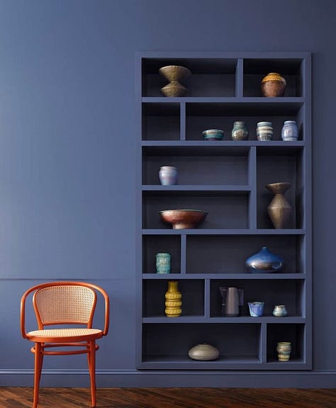
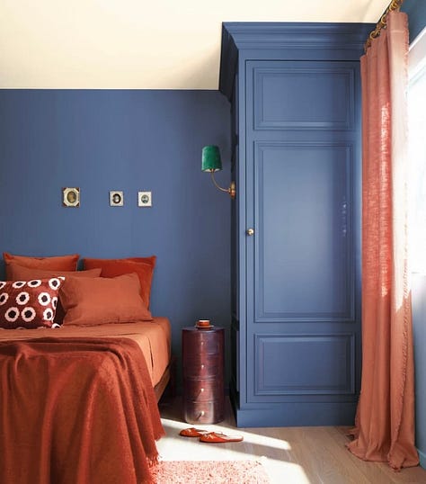
Alongside Benjamin Moore’s suggestions on how to use Blue Nova I’ve also chosen a selection of my own inspirational images which I think you’ll like, and will help inspire you on how you can incorporate this colour into your home.
Where Dulux recommends a selection of colour stories that works with their Colour of the Year Sweet Embrace, Benjamin Moore has selected a complete colour palette for you to chose from where you can mix and match as you desire.

What’s interesting is how many similarities there are between the Benjamin Moore Colour Trend Palette and some of the colours which Dulux have selected particularly for their and Warm and Calm colour stories.
Although Pantone don’t normally announce their Colour of the Year until December I have found their Fashion Colour Trend Report for Spring/Summer 2024 following New York Fashion Week.

It will be interesting to see if any of these shades link with their Colour of the Year.
Anyhow, I digress as the whole purpose of this post is to show some inspirational images on how you can incorporate Blue Nova into your home.
Classic combination
You just can’t beat a classic blue and white combination, and these images by Indigo Plaza Deco (left image) and Laminex AU (right image) are perfect examples how well this combination works.

Combine with neutral tones
As a lover of all things neutral and especially earthy tones I do really love how well this shade of blue works against a light, neutral wood (left image), or combined with a neutral background, especially when the blue is called out as a highlight on a piece of furniture (right image).
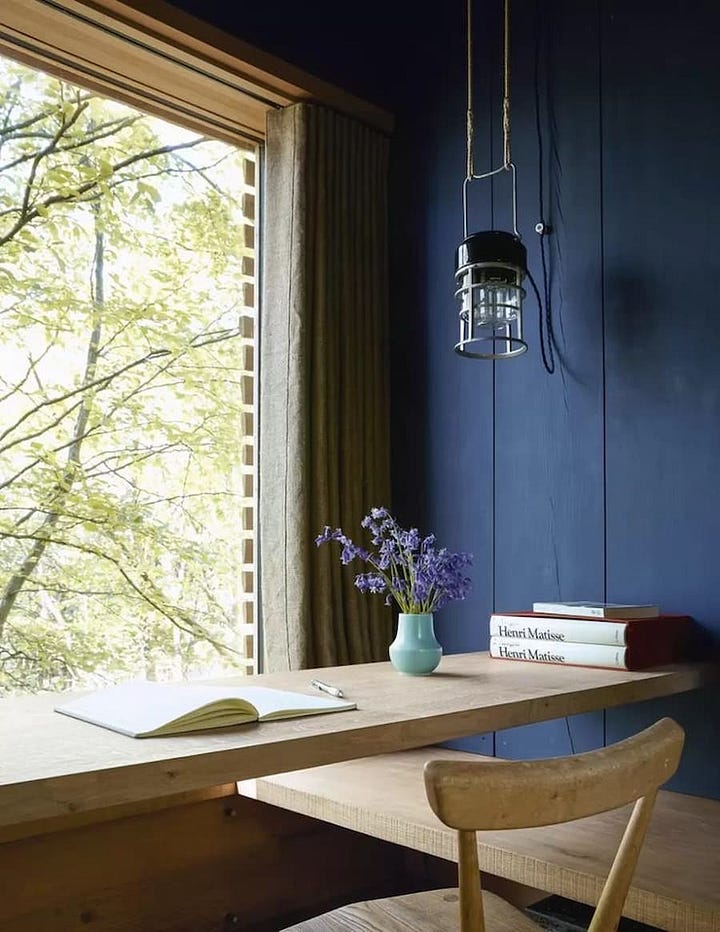
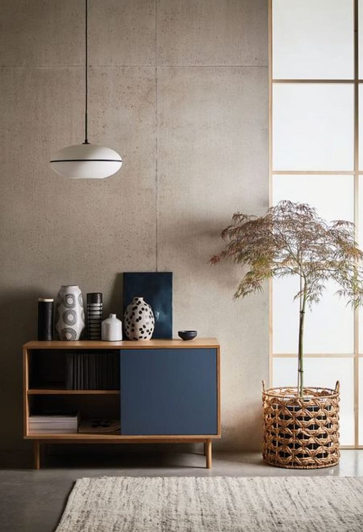
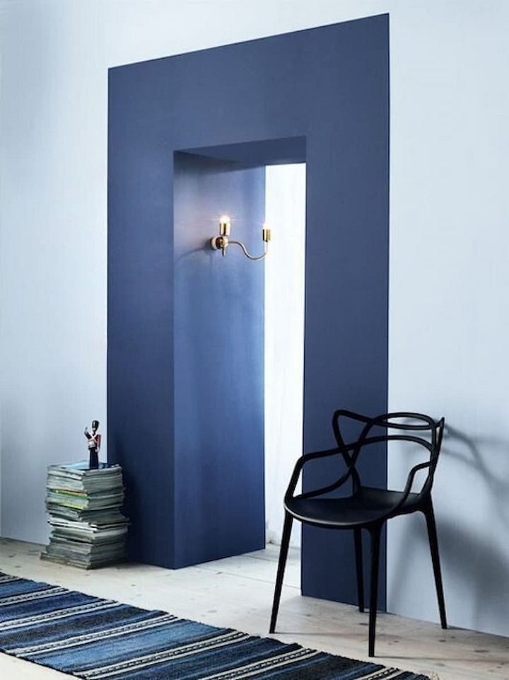
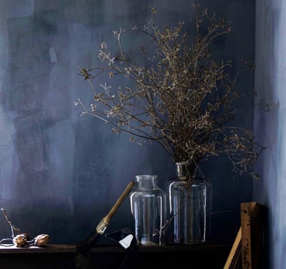
Making a real impact is this beautiful shade named River from the Hans Blomquist collection for Bauwerk Colour and again how effective this works when combined with the natural beauty of nature.
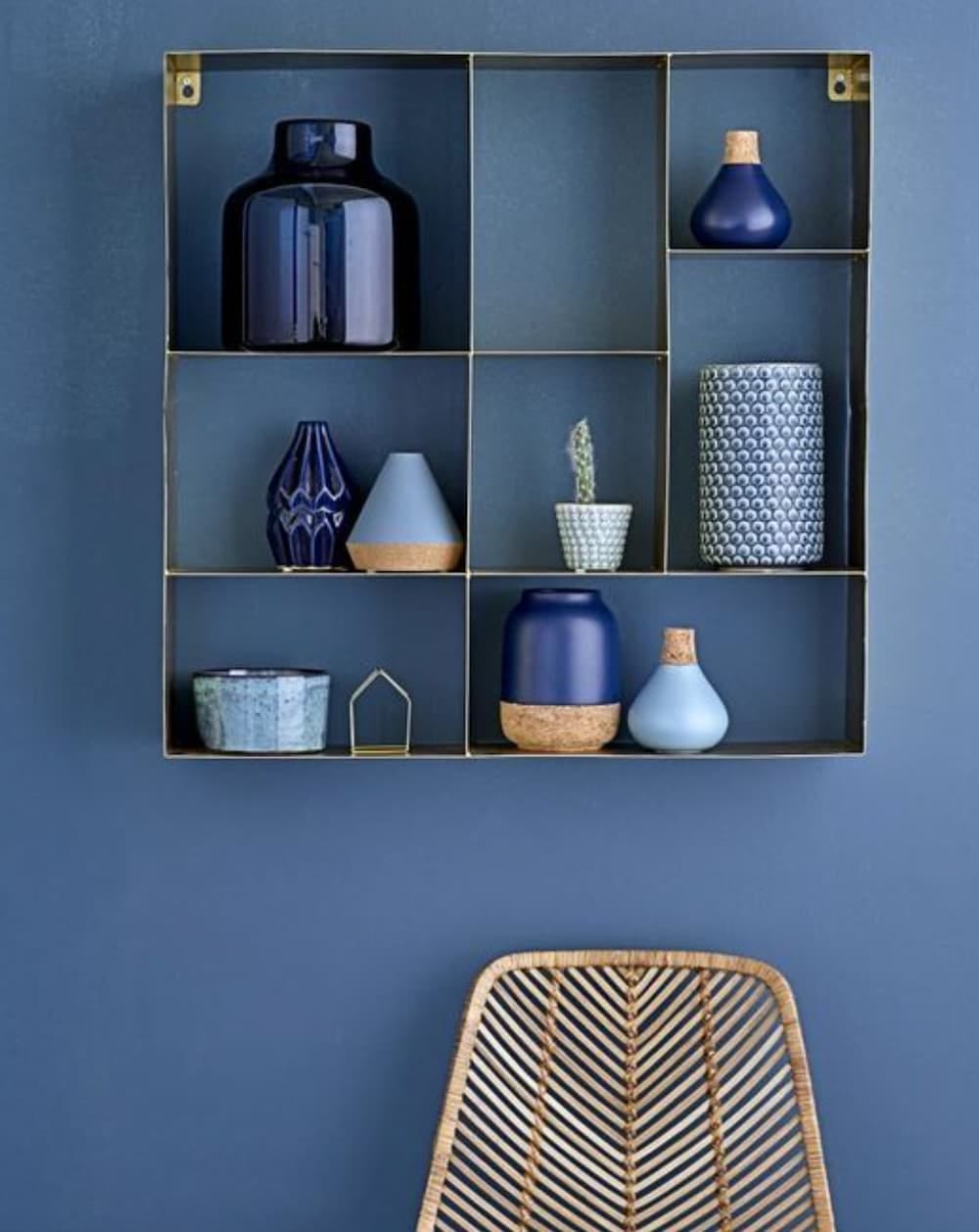
Another favourite is this stunning image found on Pinterest, displaying a collection of varying tones of blue accessories when combined with natural wood and cork.
Bold and beautiful blues
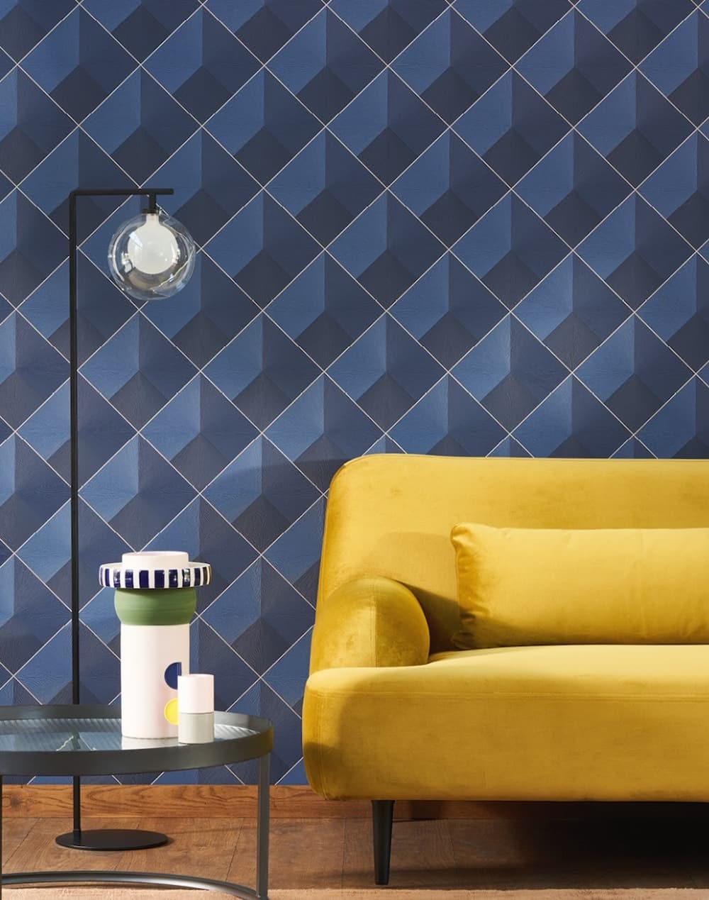
Finally, for the wallpaper lovers out there, this bold geometric design from Casadeco is extremely effective, and shows how well combining two varying shades of blue work together, and for the real “wow” factor, combining with a vibrant, bright bold colour such as yellow or orange.
So, what are your thoughts? Is Blue Nova a colour you’d consider in any of your future decorating plans?
“This alluring mid-tone features an enchanting duality, capturing the spotlight with endlessly classic appeal.”
If you’d like to discuss further how to use this colour in your home, feel free to book in for a consultation.
Don’t forget to celebrate twelve months of launching my Home Styling business I’m offering 12% off throughout the month of October.
If you’ve enjoyed reading this post, I’d love for you to leave a comment or share.
Thanks



Well I’m impressed Sonya, because there are some beautiful images you’ve found here, & it all looks pretty good 👌 Saying that, I still think it would take an awful lot to draw me over to the Blue side, but I can tell you that the said colour isn’t quite as far down the list of dislike as it used to be, so thank you for that! Another great read 👍🏻💙
I’m so excited. I have this colour as our kitchen from a decade ago. 😄
I love to see how it’s styled now.