How to use Dulux colour of the year: Sweet Embrace in your home
If you’re a fan of home interiors I’m sure you saw the announcement last week.
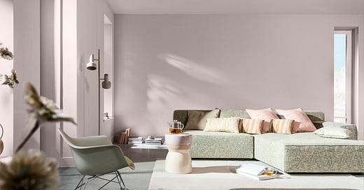
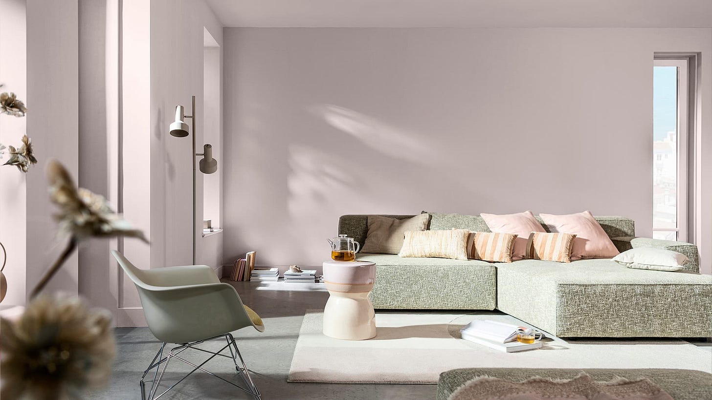
Every September Dulux announces their Colour of the Year and Sweet Embrace is the chosen colour for 2024.
Described as a kind, delicate tone that brings a feeling of positivity to our lives.
In todays, busy, chaotic and very often turbulent times, trends are still very much focussed on the uncertainty of what modern life has to offer and Sweet Embrace is a tone to offer comfort and assurance.
“like a whisper of reassurance in a moment of stress”
Whenever the new colour of the year is announced, whether it’s from Dulux, Pantone or Benjamin Moore, I’m always a little uncertain on the choice, particularly from Pantone!
However, having researched over the last few days since the Dulux announcement I have to say I’m warming to this delicate new neutral and its actually really quite versatile, working well with a number of colour combinations.
For anyone that follows me on Instagram you will be familiar with my monthly colour montages, and over recent months I’ve wanted to explore other shades outside of the stereotypical perception of creams, beiges and taupes, and showcasing New Neutrals has been my primary focus.
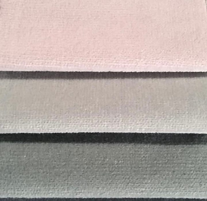
New neutrals add an element of warmth; I’ve presented a selection of beautiful combinations ranging from delicate, buttery yellows to tranquil dusky pinks, alongside calm tones of sage green and even adding in a mix of soft blue tones with a neutral undertone.
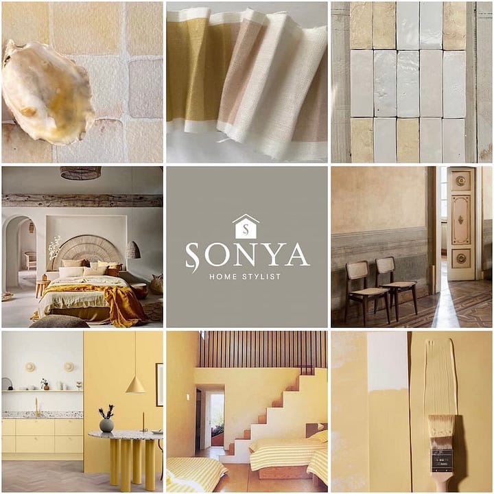
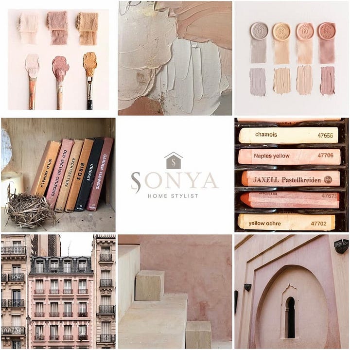
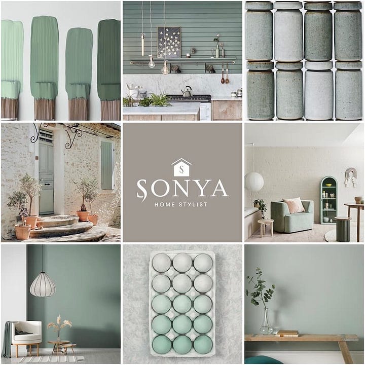
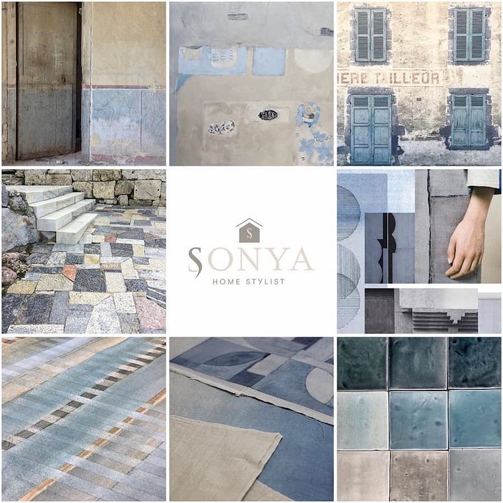
Anyhow, back to showing how to use Sweet Embrace in your home.
Sweet Embrace is extremely versatile, working effectively as a stand-alone colour, or combined with one of the three unique colour combinations that Dulux recommends:
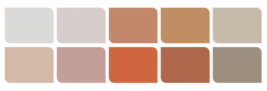
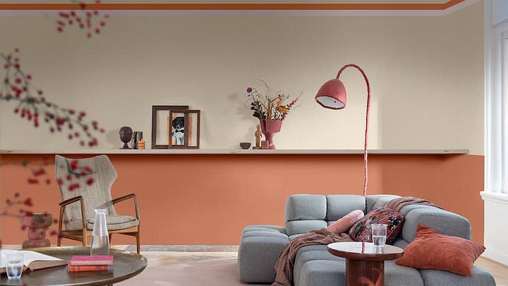
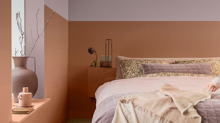
Earthy tones for a warm colour story
Natural greens and blues for a calming colour story and finally
Happy tones of lilacs and yellows to create an uplifting colour story
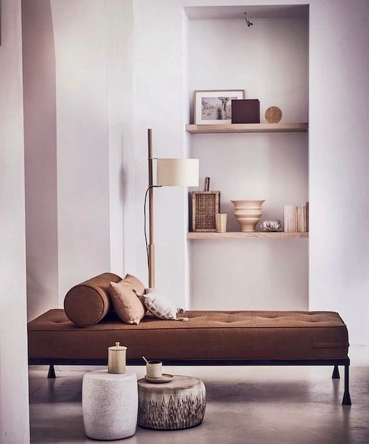
Warm colour story
If you want to add a warm, comforting feel to your home, this combination of autumnal shades, combining copper tones alongside rustic earthy options is the perfect colour combination.
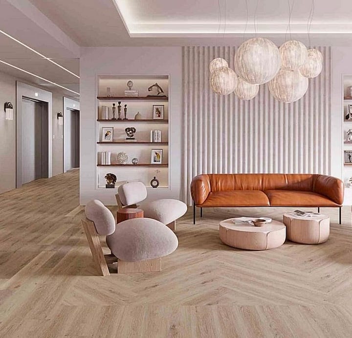
Calm colour story
Combining natural greens and blues with Sweet Embrace offers a beautifully tranquil, calm colour palette.

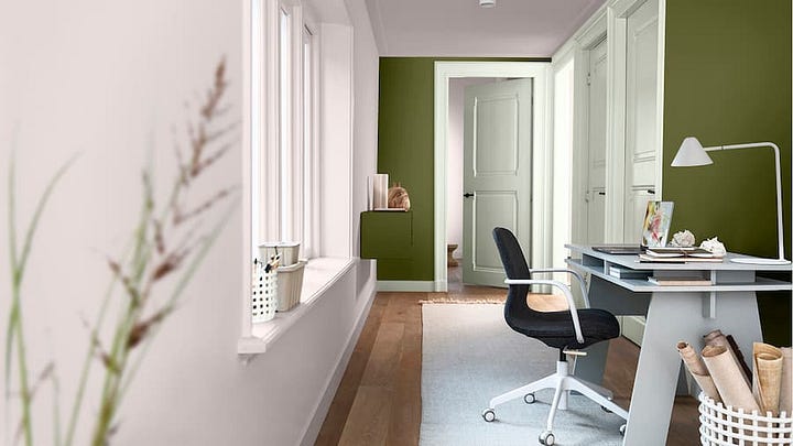
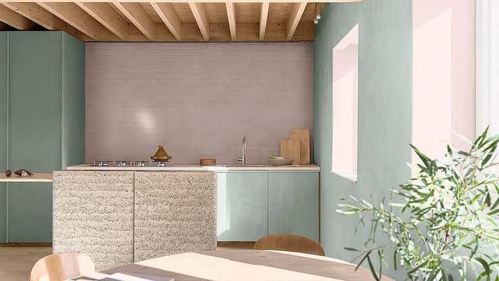
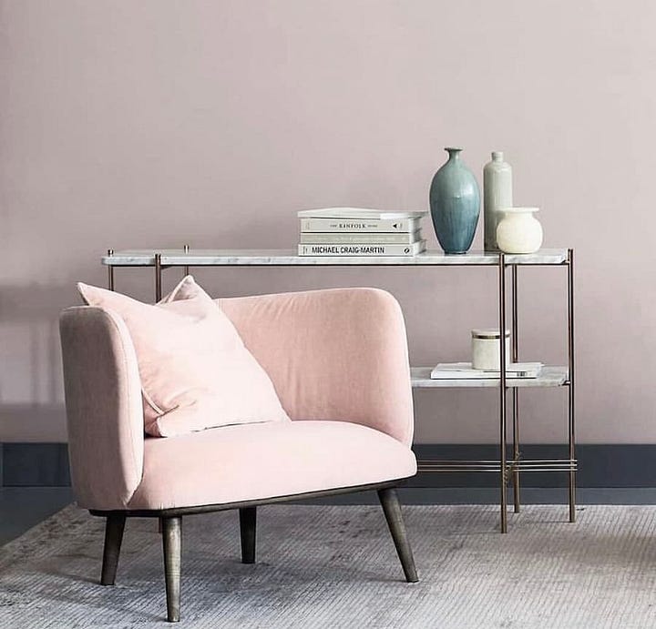
Uplifting colour story
If you fancy creating an upbeat fun, friendly living space, consider combining Sweet Embrace with soft ochres and warm neutral stone tones.

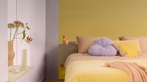
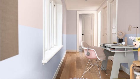
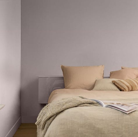
“While being a beautiful standalone colour, it's a hue that perfectly combines with so many other shades”
I would love to hear what you think.
Will you be considering using Sweet Embrace in any of your future decorating plans?
If you’d like to see more colour combinations on how this colour could work in your home, feel free to book in for a consultation.
If you’ve enjoyed reading this post, I’d love for you to leave a comment or share.
Thanks





That was a great read Sonya. I’m actually writing about colours of the year for this weekend. We have similar views!
Choosing interior color schemes can be tricky and this post has done such a lovely job of selecting beautiful palettes and showing how they can come together in a range of interiors.