Colour Drenching vs Double Drenching: What option is best for your home?
Your guide to using this year’s most talked-about paint technique
Earlier this year, as I do every year, I shared some of the predicted home interior trends for 2025:
While I don’t believe in following trends just for the sake of it, or think you should be rushing to redecorate your home every time a new look is announced; I do believe that, as a Home Stylist it’s my role to share ideas and inspiration that might help inspire you if you are looking to add a little newness to your home.
Plus, let’s be honest… it also helps provide fresh, new content for my weekly posts!
This week, I’m sharing one of 2025’s most talked-about paint techniques; Double Drenching.
As an interior lover, you’ve probably heard of colour drenching, a trend that's been hugely popular in recent years. However, for 2025 it’s being taken to a whole new level with double drenching.
Before we explore double drenching, lets just recap colour drenching.
What is Colour Drenching?
In simple terms, colour drenching is when you paint an entire room in one single colour, not just the walls, but also the ceiling, skirtings, doors and sometimes even radiators and/or furniture.
Gone are the days of traditional white ceilings and woodwork, and only the walls being painted in a contrast colour. Colour drenching is all about immersing the space in one cohesive hue for an ultra-stylish look.
Whether you choose one single shade, or a combination of closely related tones, the result can be both sophisticated and impactful.
Now that you’re familiar with colour drenching, let’s take it a step further by exploring double drenching.
Double Drenching
Double drenching takes the concept of colour drenching to the next level by using two or more related hues to paint all available surfaces in a room.
So, why go beyond colour drenching?
While colour drenching focuses on a single shade to achieve an ultra-stylish look, double drenching pairs complementary tones to add contrast and character.
The variation in hues, even within the same colour family, adds depth and dimension, creating a layered effect that makes the room visually engaging.
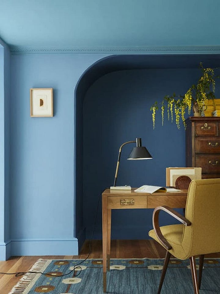
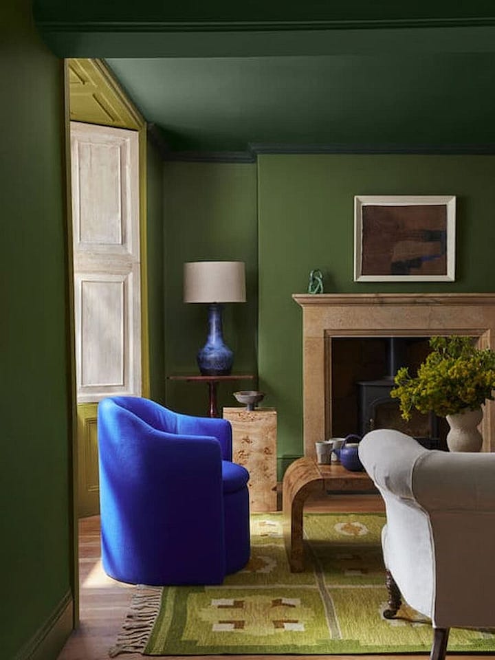
This new approach is a fabulous way to confidently embrace colour combinations that might not typically be seen together in one space.
Where to use double drenching
Double drenching isn’t a technique typically suggested for use throughout the entire home.
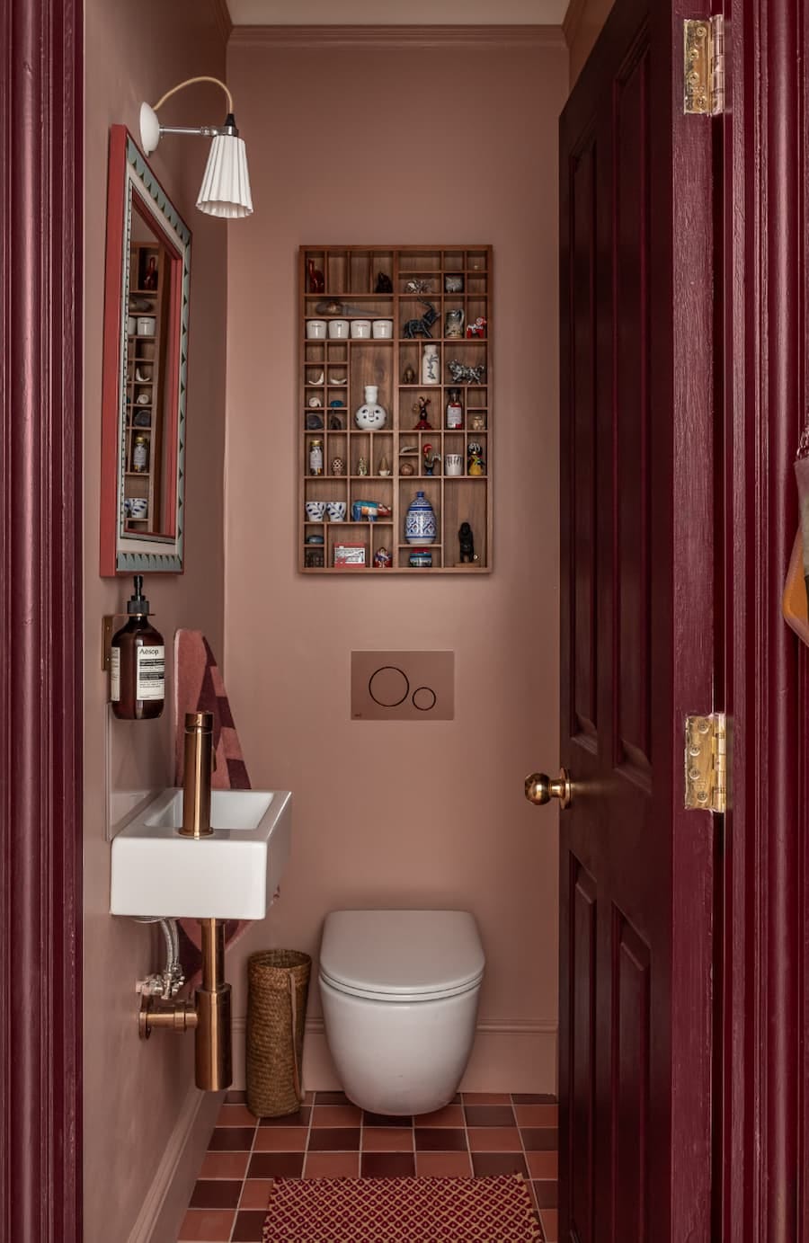
Instead, it works best in smaller, more intimate spaces such as a bedroom, study or cloakroom; providing these smaller areas with character and creating an element of surprise.

This striking cloakroom, designed by Joanna Williams, is a perfect example of how effective double drenching can work. The use of varying tones of coral throughout the space, including the handbasin and accessories, creates a look that is both bold and cohesive.
Additionally, double drenching can work beautifully to highlight classical architectural features, especially in period properties.
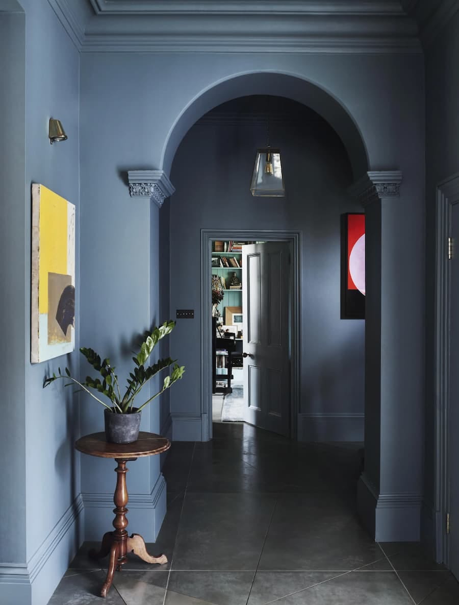
In the image below, designer Rachel Chudley has used layered hues to draw attention to the architectural details of this hallway, giving a traditional space a modern edge while retaining its elegance.
How to choose the right colours for double drenching
Painting a space in floor-to-ceiling colour is already a bold move; so when it comes to double drenching your colour choices deserve a bit of extra thought.
While there are no hard rules, choosing the right pairing is all about balance, tone and the mood you want to create. A good starting point is to select colours that share similar undertones or belong to the same family, so the overall scheme feels connected.
You can’t go too far wrong with choosing one of these four go-to colour directions:
Nature-inspired greens like sage, olive, and eucalyptus create a calm, relaxed atmosphere and pair beautifully with soft neutrals or deeper forest shades.
Earthy hues including rust, terracotta, ochre, and clay create a warm, inviting atmosphere. These rich tones work beautifully in cosy rooms like studies or guest bedrooms and they pair wonderfully with sandy neutral or deeper browns.
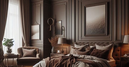
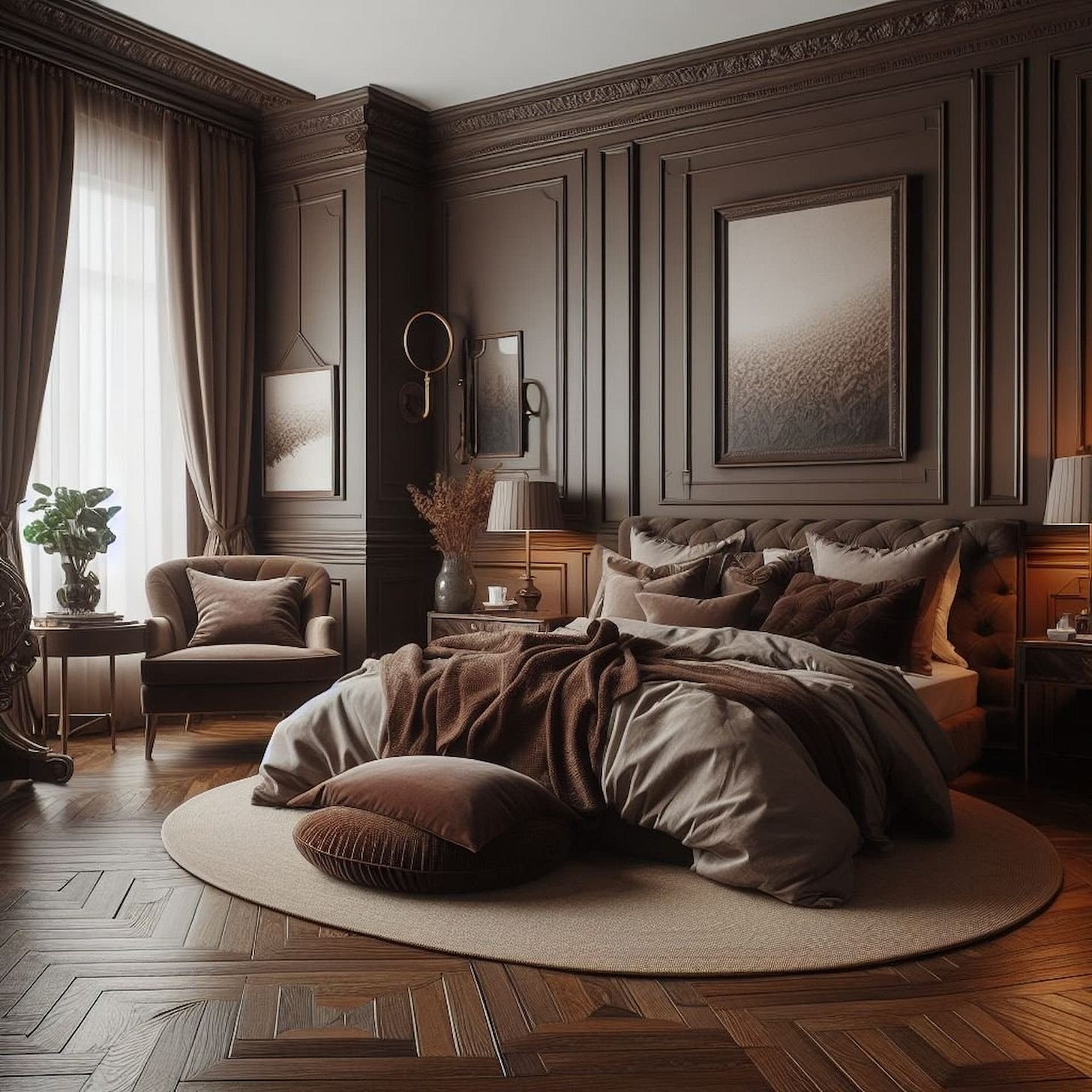
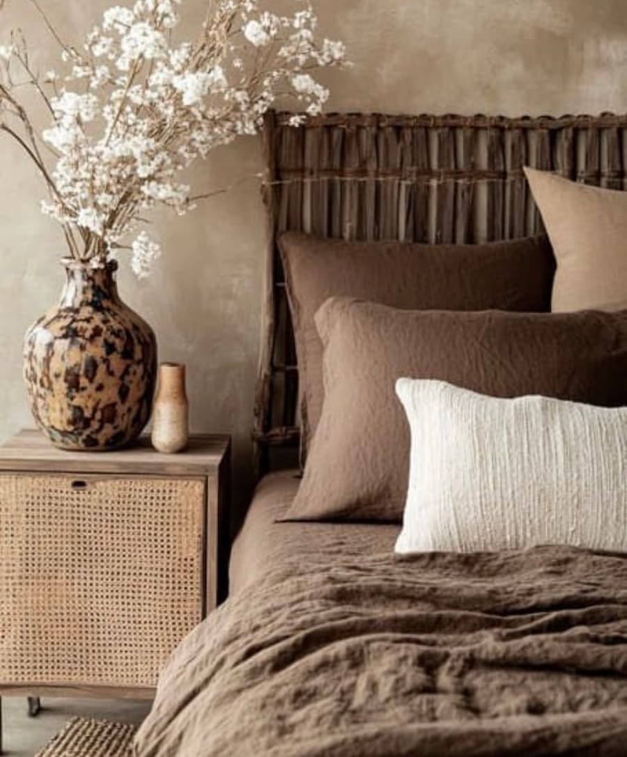
Cosy browns like chocolate, coffee, caramel, and taupe remain strong choices for creating a soothing, warm vibe. Layering different shades of brown; from lighter taupes to darker chocolates, can provide a serene, cosy space.
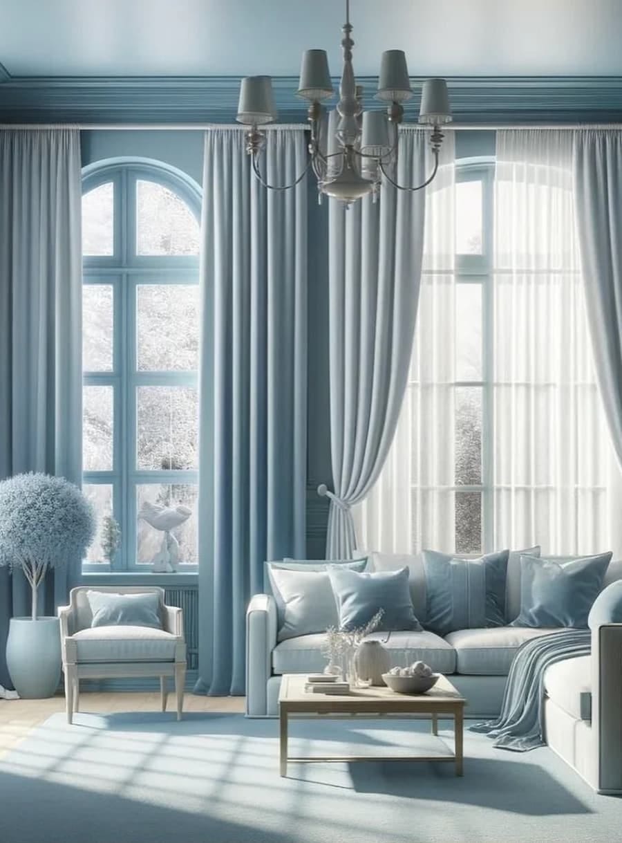
Calming blues range from soft powder blues to deep navy and inky indigo. Blue is timeless and layering different blue tones; whether light or dark; helps create a calm environment, perfect for bedrooms or home offices.
Nature-inspired greens
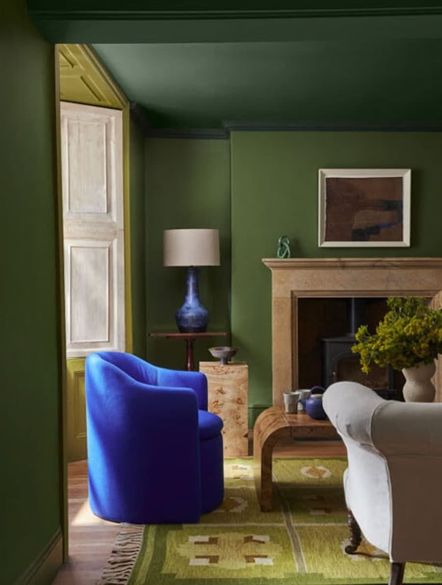
This space beautifully combines three varying tones of green, a rich shade is used on the ceiling and cornice, a softer-mid tone on the walls and a more vibrant hue highlights the window alcove.
Earthy hues
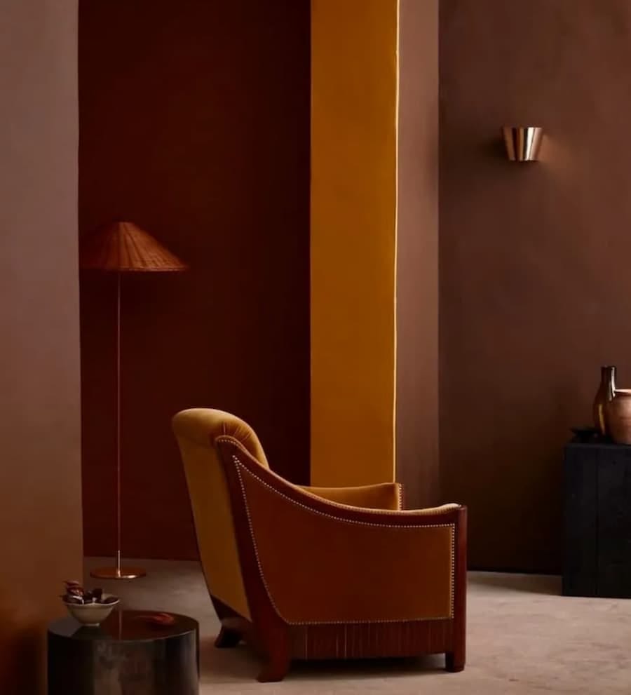
This image by Craig & Rose shows how earthy tones can be layered to create the real wow factor. The combination of complementary shades of terracotta, clay and the mustard accent, creates a bold, impactful statement that feels warm and grounded.
Cosy browns
While the panelled walls are painted in a rich chocolate brown, layering varying tones of taupe, caramel and mocha in the soft furnishings adds warmth and sophistication, perfect for creating a serene bedroom vibe.
Calming blues
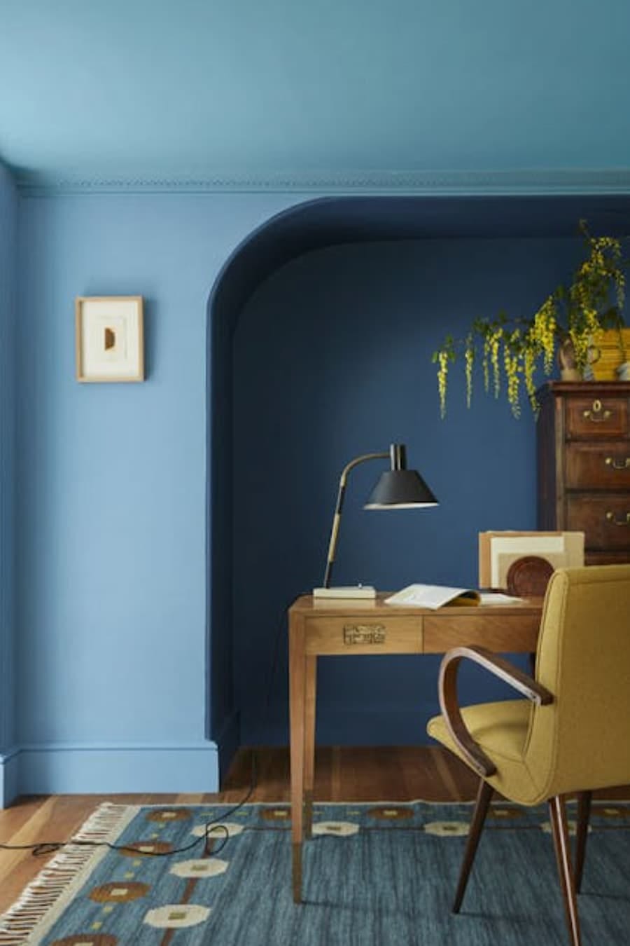
In this serene home office, three tones of blue are used to softly define the space. A bright, fresh hue for the ceiling, a mid-tone on the walls, and a darker accent for the alcove, creating a calming, considered work space that feels fresh and focussed.
Styling tips
If you’re feeling inspired to try double drenching, here are a few simple styling tips to help you get started:
Start small
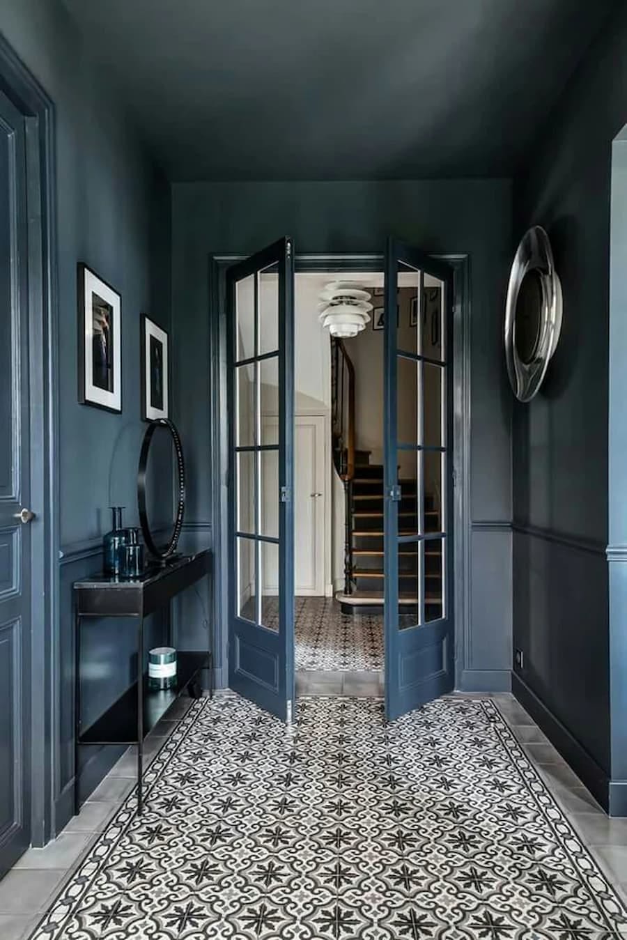
This design by Otta Design is a perfect example of how impactful double drenching can be in a smaller space. A carefully curated palette of tones from the same colour family runs throughout; from the wall colour to the woodwork, right down to the beautiful tiled floor.
Repeat colours through accessories
It doesn’t have to be all about the paint. Accessories are a cost-effective way to introduce colour into a space, and an easy switch if you change your mind at a later date. Opt for soft furnishings in your chosen tones to create a cohesive, well-considered look that connects the whole scheme together.
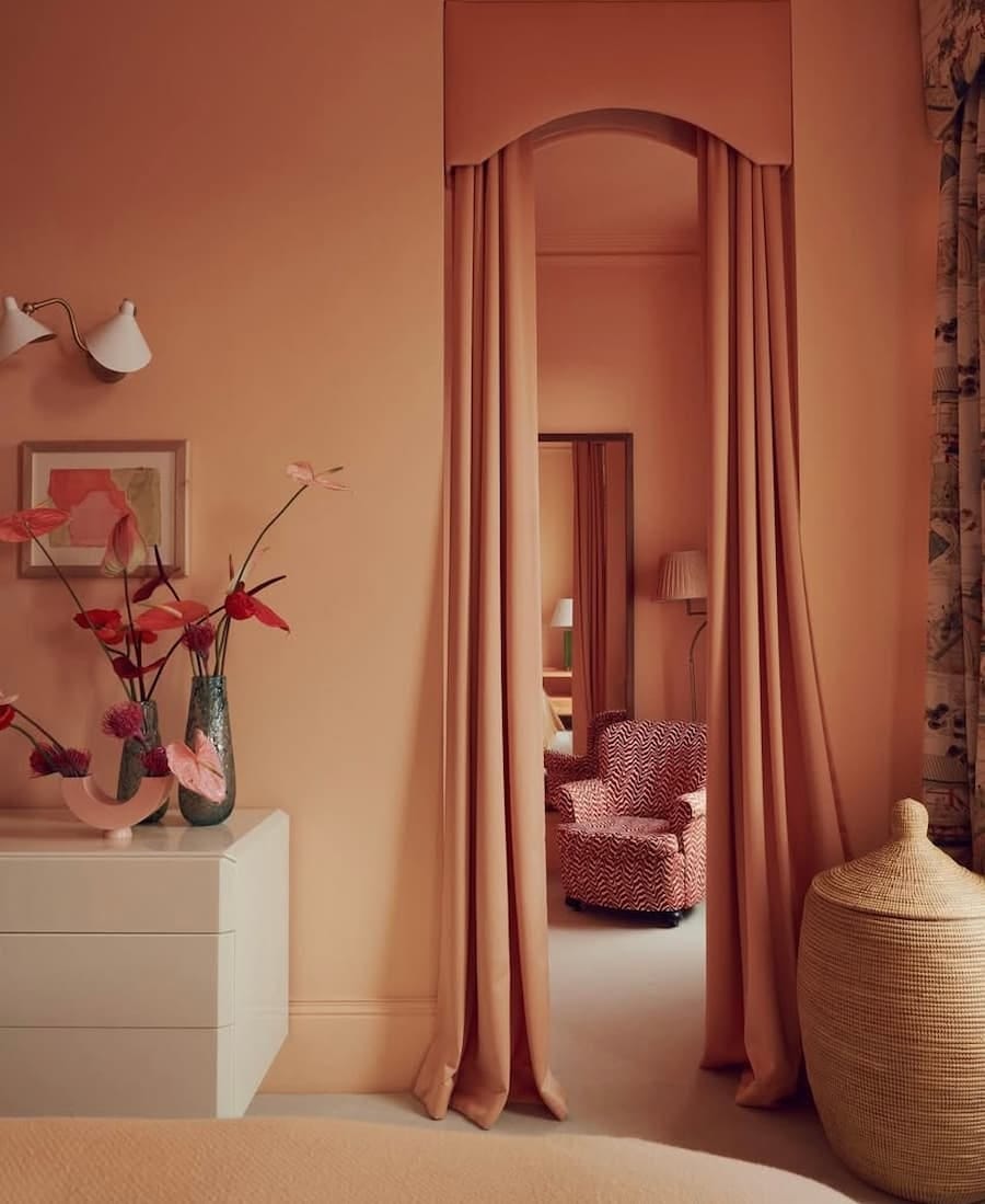
Image from Golden Design Interiors Don’t forget texture
Layering fabrics and materials like velvet, linen, or boucle in your chosen hues can really elevate the look and stop it feeling flat.
Share your appreciation for as little as £3.50 a month or subscribe to an annual membership for just £35 for the year.
Will you be introducing double drenching into your home?
Whether you start small in a cloakroom or go bold in a bedroom, double drenching is a brilliant way to bring depth, character, and a touch of drama to your home.
As always, it’s not about chasing trends, it’s about discovering what truly works for you and your home. If this post has inspired you to try double drenching, I’d love to hear your thoughts.
Next week we’ll be welcoming May and I’ll be sharing some beautiful spring-inspired bedding sets for my monthly shopping guide.
Until then have a wonderful weekend.
Thanks
Please tap on the heart 🤎 if you have enjoyed reading this post. I love hearing your thoughts, so feel free to comment. If you really want to help, please share by clicking the restack button. This helps with visibility and gets my work shared with more new readers, thank you!






Well explained Sonya. Both ways look great in the images you’ve chosen. Certainly takes some serious planning to go down the drenching route. I feel a bit old fashioned admitting that I still like a white ceiling though! 😂🤎